When you have a game with as much detail, and as many options in it like the Football Manager series, the interface between the person playing the game and the computer, known as the GUI (Graphical User Interface) is very important. Without it, you wouldn’t be able to find anything on the screen, so it’d all be a bit pointless.
当你玩一款像FM系列这样,拥有如此多的细节、丰富的选项的游戏时,电脑与玩家的直接交互界面(即GUI:图形用户界面)就显得尤为重要。没有它,就无法在界面上获取任何信息,一切也将变得毫无意义。
I’ve often spoken previously about the work that we do with usability companies to try and improve the interface and make it easier for you, the people who play the game, to navigate around, and of course we’ve done that this year. We also have some code that has been tracking our testers and beta testers use of the interface, to see which screens they visit and how they get there, and all of this work has led to what I think is a more streamlined experience.
在此之前,我经常提到我们会与一些相关的专业公司合作以改善游戏的图形界面,这一切都是为了让玩家觉得更易操作。今年围绕它,SI同样做了很多的工作。我们在游戏中有一些代码是用来专门跟踪测试玩家的用户界面使用情况的,比如经常查看的界面,如何访问这些界面等。所有的这些工作,都为了让玩家能更合理、有效率的体验游戏。
For those who’ve been playing the series for years, this years’ interface might take a little while to get used to – a few options have moved, there are some new menus, and a clearer split between “club” actions and “squad” actions and screens, but, essentially, everything is now more obvious to find.
对那些玩了好几代游戏的老玩家,今年的游戏界面可能需要一定的时间适应。移除了一些选项,也增加了一些按钮,俱乐部和球队的界面有明显的分界。但本质上,我们是为了一切都显而易见。
We’ve also added something we dub “adaptive layout”. You can see a video of this at http://www.youtube.com/sigames#p/u/19/9iTXka94ePc, but this means that the higher the resolution you play the game in, the more information you can get on screen, with less “white space” in the game. We encourage you to change the games resolution until you find the right amount of information on the screen for you.
我们增加了一个称之为“适应性布局”的功能。关于这个可查看youtube的一段视频(http://www.youtube.com/sigames#p/u/19/9iTXka94ePc),这意味着玩游戏的电脑分辨率越高,界面就可以显示越多的信息,游戏界面上越少的空白。我们鼓励你多调整游戏的分辨率,找到适合自己的、显示足够信息的游戏界面。
The key screens where these changes are noticeable is on the overview screens. These are like the manager homepage that was
added a while back, but now include profiles for clubs, players, nations and more, and add more or less panels according to the resolution. These new profiles have also been made the default for player profiles, for example, but if you want to be a luddite and live in the past, you can change it in the preferences to go to the player attributes screen instead.
所有这些变化中,最值得注意的是概况界面。比如此前的主教练主页面,现在也包括了俱乐部、球员、国家等等资料,至于信息的多少也取决于游戏的分辨率。例如,新游戏中球员界面默认显示球员资料,当然,如果仍然怀念以前的球员属性界面,可以在游戏选项中修改。
On the squad screen, and most screens with columns, you can add and remove columns to your hearts’ content, to really have the interface the way you want it to.
在球队阵容界面,大部分内容以列显示,你可以增加或移除不同的列信息,制定自己心仪的游戏界面。
In the spirit of configurability, and as we’re regularly asked on our forums how to change some of the text colours in the game and in particular the colours of the attribute values, we’ve now made this easier too.
我们一向遵循一切皆可配置的精神,又鉴于论坛上经常有人询问如何修改游戏中的文本的颜色、属性的颜色,我们也针对此做了一定的工作,现在改变这些将变得易如反掌。
The way to do this before was by manually extracting and editing an xml file which isn’t the easiest to explain to people who just want to change a few colours. We’ve now got a simple Attribute Colours panel in the Preferences screen where you can pick your own colours for these and some of the other colours used throughout the game.
此前,若想修改颜色属性,需要编辑xml文件,但这对普通玩家并不容易。我们现在在游戏选项界面上,有一个简易的属性颜色修改按钮,可以选择自己喜欢的颜色,并由始至终贯穿于游戏中。
We’ve also changed the way you navigate using the Back and Forward arrow buttons. Previously, clicking on them would go through the different players or teams etc. that you’d visited, rather than the different sections within each player or team. So, if you had gone from the team Squad screen to a player’s Profile, and then gone to look at his contract details, clicking on the Back arrow would take you back to the squad screen, which doesn’t really make much sense in this world of people being used to web browsers.
游戏中前进、后退按钮的操作方式,也有诸多变化。此前,通过点击它可切换到玩家曾查看过的某个球员或球队的不同部分,但现在则直接切换到不同的球员或球队界面上。在之前的游戏中,如果你从球队阵容界面到球员资料界面,然后查看他的合同细节,点击后退按钮,将回到球队的阵容界面上。这与大家习惯的浏览器的模式并不相同。
Now i【屏蔽词语】 Back, it will go back to his Profile, and then clicking it again would take you back to the Squad screen.
现在如果点击后退,将回到他的资料界面;再次点击,将回到球队阵容界面。
However, much like web browsers, if you hold down the back arrow, the last 25 panels you’ve visited are there, so you can just go straight to the one on the list you want to go to. Or, if you want to be a luddite, you can change the system back to what we had in FM2011 in the preferences…
此外,就像网络浏览器一样,如果你一直按住“后退”按钮,那么刚刚浏览过的最后25个界面就会依次列出,你可以从列表中选择你想要回顾的那一条。不过如果你是一个狂热的勒德分子(译注:强烈反动自动化的人)的话,你也可以在参数设置中选择回到FM2011时使用的系统界面……
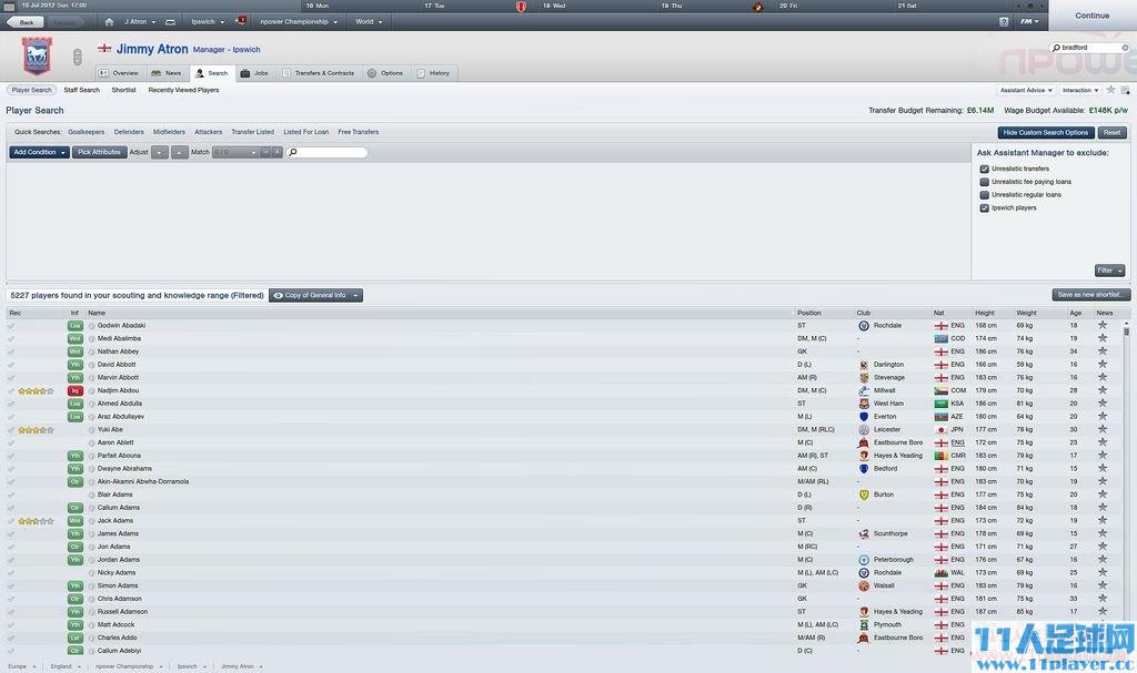
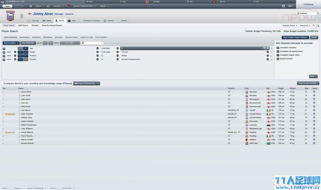
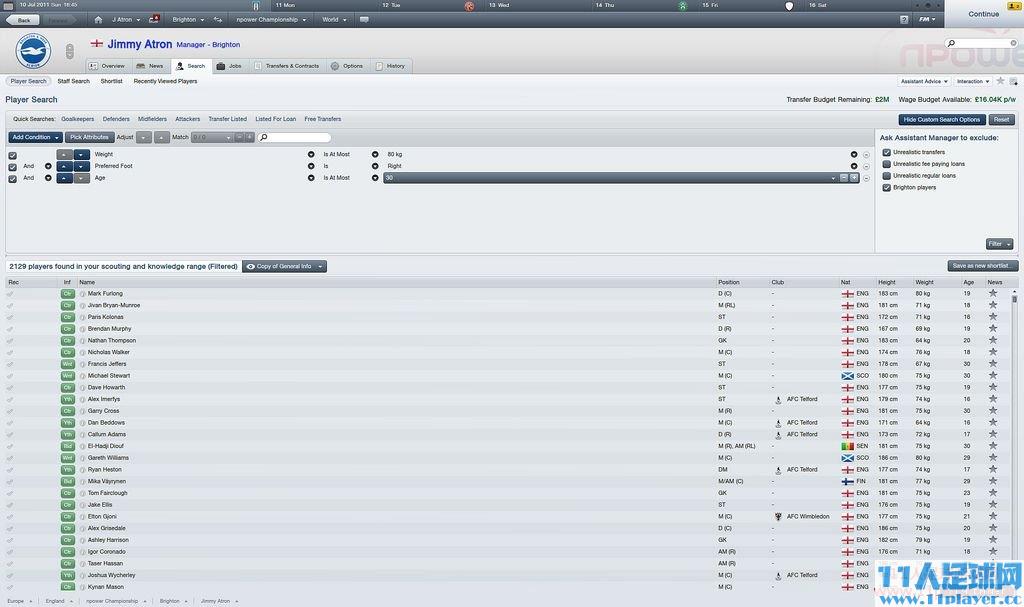
There are also huge changes to way that you can search for players and staff in the game, with a much more powerful filtering system. There are some new ones in there, but it’s a lot easier, and quicker, to filter to find exactly the kind of player and staff that you want to sign.
游戏中的球员和职员搜索系统同样进行了大幅改进,我们为玩家提供了一个更加给力的过滤引擎,虽说添加了不少新选项,但它们会帮助你更容易更快速地寻找到更加符合你要求的球员或职员。
This is one of those features that is quite difficult to describe in words so here are some screenshots that show you how it works.
百闻不如一见,这种直观的特性就算我说到口干舌燥大家也可能会不知所云,因此我在这儿特意为FMers提供了几幅游戏截图,相信你们会喜欢的。


It should also be mentioned that the list updates dynamically now as you change your search parameters.
另外一个值得一提的改进就是当你修改搜索参数时,球员列表会根据你的变动实时动态更新。
And whilst we’re in screenshot mode, tomorrow’s blog will be a little bit different to the others. No video blog. Not much being written, just lots and lots of screenshots for features we’ve already talked about. And maybe some we haven’t, but will be in the coming weeks…
今日的图形界面介绍就到此为止了,明天的blog将和以往有点不一样——没有视频,没有过多的文字,取而代之的将是大量的游戏界面截图,我们之前介绍过的不少新特性都会直观地呈现在大家眼前。当然啦,那些还没来得及写进博客的新变化也会让大家一睹为快的……
